An interactive horse racing installation where visitors colour a horse, name it, and race it against the crowd.
When Sandpit was engaged to develop four interactive installations for the museum's permanent gallery, one brief stood out: build a horse racing experience that children would genuinely love, without a single reference to gambling.
What needed to be built:
Every decision, from template size to race length, came back to these four goals.
There were a lot of moving parts in this one, across both physical and digital touchpoints, and I loved working through all of them. The moderation piece was especially satisfying. Rather than trying to catch people out after the fact, the goal was to design a system that responded so clearly that visitors understood the rules without anyone having to explain them.
This project was completed as part of my work with Sandpit. Key collaborators included Nick Lewis (illustration), and the wider Sandpit team: Dan Koerner, Cameron James, Jude Henshall and Diana Trajanovski.
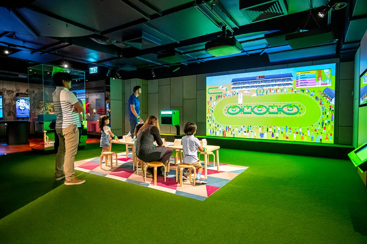
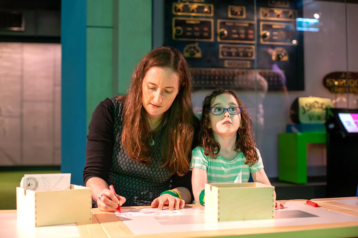
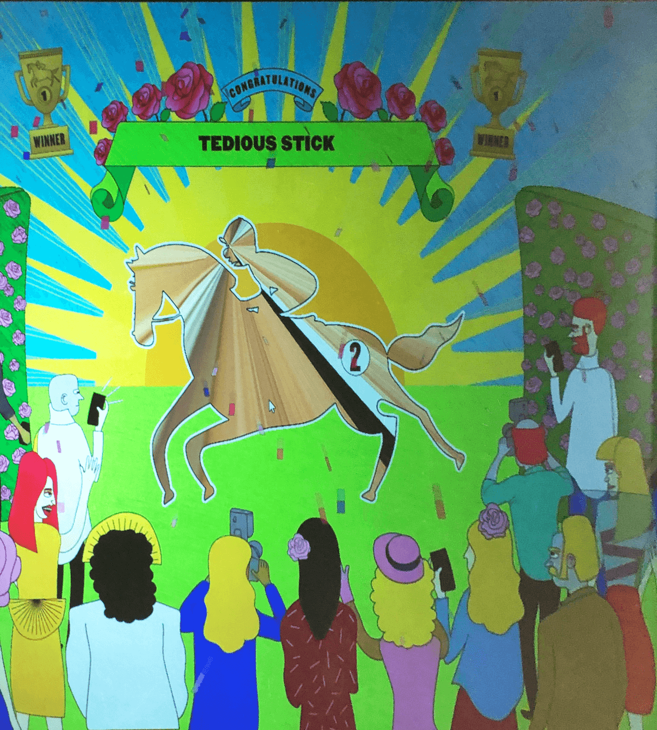
Visitors move through the experience in three stages: colour a template at the colouring station, scan it at the onboarding booth to name their horse, then watch it race on the large screen. Races fire every few minutes, with generated horses filling any empty slots so a solo visitor still gets a proper competitive race.
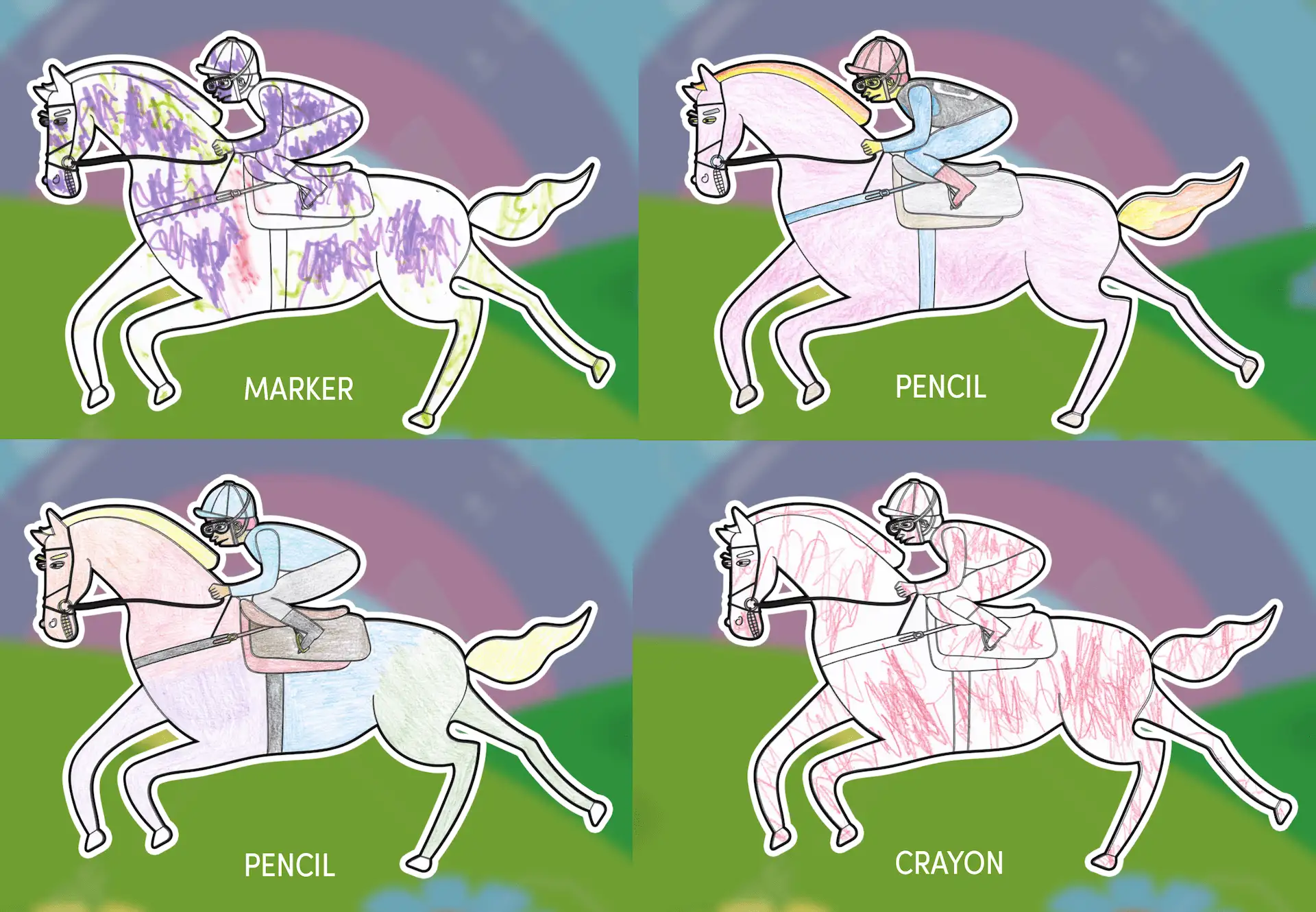
Getting to that smooth loop took real work. Template size and drawing materials were chosen to balance colouring time against scan quality, since brighter colours read more cleanly. Race timing was refined across many animation tests to hold energy from the naming screen through to the finish line. Moderation ran without on-site staff: flagged words and drawings caused the horse to scan in white, giving the visitor clear feedback rather than a confusing blank. A backend portal let staff disable markings mid-race if anything slipped through, and the three-minute race cap meant any issue resolved on its own quickly.
For an installation built primarily for children, physical ergonomics were as important as digital usability. Template sizing and booth placement were considered for usability across a wide age range, so younger visitors could move through the experience without needing adult assistance at every step.
The race display combined large-scale visuals with live commentary so the action could be followed through either channel. The moderation system was also designed to communicate clearly: a horse scanning in white gave immediate, unambiguous feedback to the visitor rather than silently failing or creating confusion about whether the equipment had malfunctioned.
A Day at the Races was one of four installations Sandpit delivered for the Australian Sports Museum's permanent gallery. The full fitout won the top prize in the Permanent Exhibition or Gallery Fitout category at the 2020 Museum and Galleries National Awards (MAGNAs), presented by the Australian Museums and Galleries Association. In 2024-2025, the museum welcomed 187,057 visitors, breaking its previous record of 175,000.
Great interactive experiences need to work for every visitor who walks through the door, regardless of age, ability, or how long they have before the bus leaves. Let's build something that holds up in the real world.